

Undoubtedly, the design has become the heart and soul of Microsoft Office. In fact, Microsoft has announced a redesign of new Microsoft Office icons that are bolder, lighter, combined with facile visuals and instantly recognizable symbol. Each icon was outlined to decouple all individual letters and symbols to prevent familiarity when you focus on simplicity. Therefore, in the upcoming section, we will let you know that how Microsoft redesigns its Office app icons in an absolute way.
Here, you can Meet With New Microsoft Office Icons!!
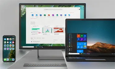
The Office icons were updated in 2013 when selfies and emojis were good enough for anyone. Over a billion people from different industries, geographies, and generations use MS Office. They work on many platforms or devices and works in an extremely fast environment, and also connected than ever before. The changing world of work focuses on the Office App that transforms into a collaborative suite and works together in real time from any device. We have added our most powerful tools with best AI: you can recognize data with less effort, start voice typing in the document, build your resume with insights LinkedIn. In addition, there are many other features added to Office suite, i.e., AI-powered meetings and chat service, Microsoft Teams.
Craft based designs
![]()
From the beginning, we adopted the Office’s rich history that can be used to inform the design decisions. The new design incorporates strong colors, which has become the core of Office brand, and new Microsoft Office icons may be evolved the palette. Color now differentiates the app and creates the personality, and for a new icon select hues that are lighter, bolder, and friendlier — a nod to the evolution of Office suite.
The flexible system works across different platforms
Today’s workforce involves five generations using MS Office on various platforms and devices and in the environment spanning work, and home. The new MS Office icons that work across generations, platforms, and devices, and echoes the energetic nature of productivity.
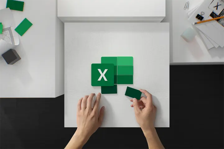
This solution was designed to decouple letters and symbols in each icon, essentially creating two different panels that we can pair or separate. It will help to maintain familiarity while highlighting the simplicity inside an app.
Human Centered Design
In the modern arena, most of the people are connected with each other. Office app supports this by making it easy and quick to express an idea, collaborate with others, and stay focused during work. That’s why Office apps originate together, allow users to open PPT (PowerPoint) or Excel beside the team conversations.
To consider this within the icon, delete visual boundary: the traditional tool formatting. On the other hand, the new Microsoft Office icons contain document outline for MS Word and spreadsheet outline for MS Excel, now this design will show each line of text for Word document and individual cells for Excel. By focusing on content rather than a particular format, these icons include the collaborative nature of apps that they represent. So, we can easily change the letters to symbol ratio.
This icons in Microsoft Office changes will roll out over the next few months and will also involve new icons for Word, Excel, PowerPoint, OneDrive, Outlook, OneNote, Teams, Yammer, SharePoint, and even Skype.
Summing Up
Microsoft has released new Office app icons in 2013. The redesign of new icons seems to be very helpful to understand. Therefore, in this blog, we have also covered all new Microsoft Office icons suite in a clear way. In fact, each icon involves a unique and identifiable symbol, there are connections inside the app symbol and collective suite.


