Microsoft Reveals New Outlook.com Design for Better Search
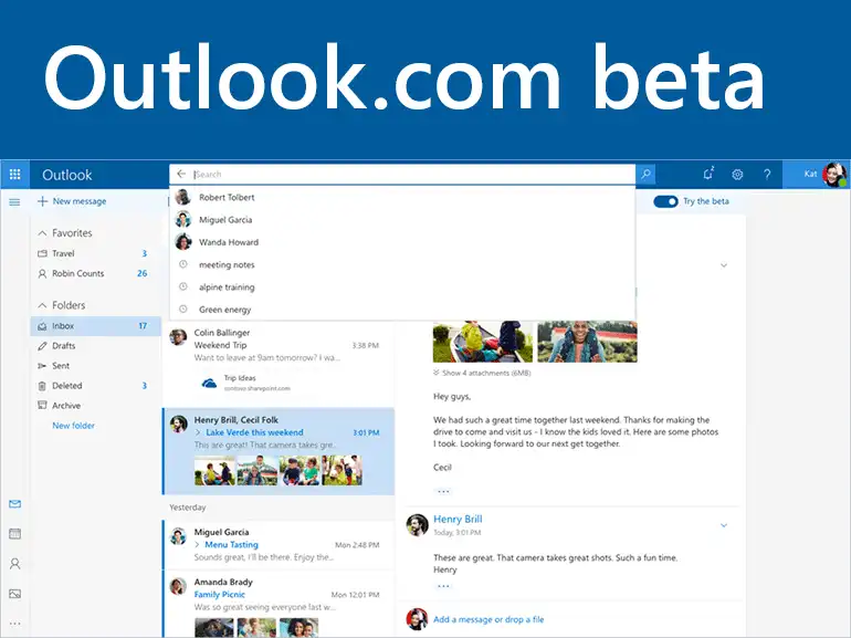
Microsoft has recently announced the Outlook.com beta version that will be activated by “try the beta“ using the provided toggle. This will be available to all users within few weeks and if users do not like it, then they can easily switch back to the old version also. Microsoft is updating the New Outlook.com Design with some extra changes. Like, it includes better conversion view and makes it more easy for the users to read and attach file quickly. In addition, the updated version is will let users have new search experience. In addition, note that this is the 3rd iteration of Outlook.com as it was first launched in 2012.
The main aim of Microsoft is to test all new features in the beta program and if all works well, they will add all of them in the standard version of Outlook.com. However, if a user wants to try these updated features in new Microsoft Outlook.com, then he or she can easily click on the Try the Beta switch, which is located in the top right corner of the inbox. Before switching to the Outlook.com beta version, it is important for a user to know about the new features in detail. Thus, this blog lets users know all new features of Outlook.com.

A Quick Look at What’s Appealing in New Outlook.com Design?
As discussed above Microsoft has launched the new Microsoft Outlook.com, then what all it is offering. This section covers all the major updates.
Read more : To know Outlook Error 800ccc0e-0-0-560 IMAP
A Great & Fast Search Experience in New Outlook.com
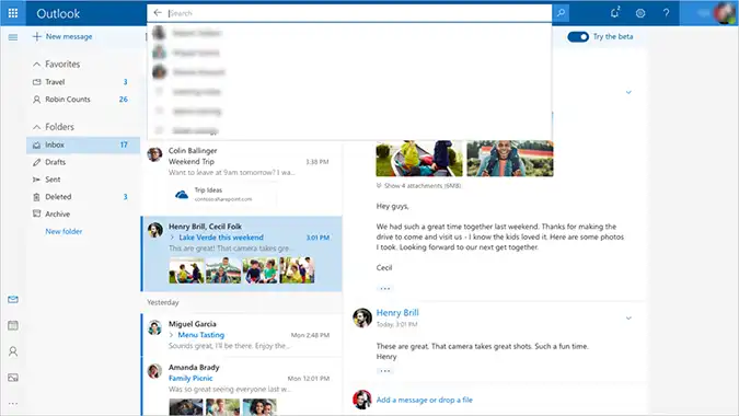
Microsoft is using more responsive web development framework in order to deliver a new and upgraded search feature. It let users have a fresh look at modern conversation style and a brand new design that let users view, read, attach files and photos more quickly. The new search interface is situated at the top of the inbox instead of the side, and it also includes emails and people in its results. In addition, the interface also provides preview of files and photos in the conversation list. Apart from all this, Microsoft makes it for the users to people in the inbox by tagging favorites people.

A Smarter Inbox
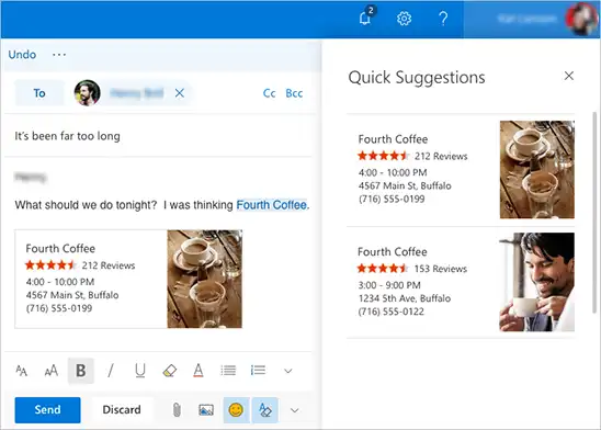
In New Outlook.com Design, the inbox displays some quick suggestions also as a user type something. This will make it easy for the users to add information related to any restaurant, flight, and favorite teams’ schedules in their conversations. In addition, it improves the photo experience also by putting all pictures sent or received by the users in an email at one place. This will make it easy for the users share them with others. Thus, this latest and modern conversation style make all this easier for the users to handle and preview all photos and attachments.

Personalize Your Inbox in New Outlook.com
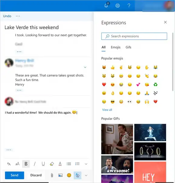
Users can personalize their inbox with the favorite people and folders also in this new Microsoft Outlook.com. This will make it easy for the users look for the friends, conversations, and files. Which matter them the most and provide that quick access to all these communications and lots of expressions. It includes most of the popular GIFs and emojis that one can add to the emails.

Microsoft is putting a great effort into making New Outlook.com Design more convenient for the users. Many people widely use it as a web-based email client. Apart from all these features in the Outlook.com beta version. There will be some additional enhancements also that will be added in the next few months. It will include updates to Calendar and People also. Based on the responses by the users, they will decide to repeat, improve, polish, or discard them.

