Google Drive Redesigned Interface Matches Itself with Revamped Gmail
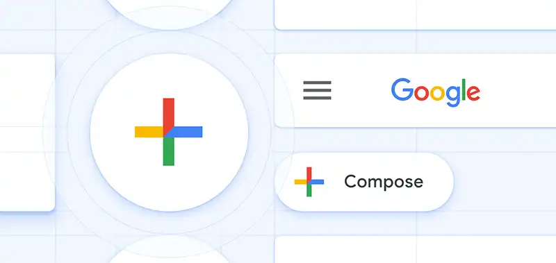
In recent time, we have seen a lot of changes in the layouts of different websites and products. First Reddit came up with a new layout after a decade and then it was Gmail. Now, the time has come for Google Drive to get a refurbished design. Google Drive has finally received a long overdue makeover and now Google Drive Redesign almost looks like the New Gmail interface. There has not been any change in its functionality, however. Simply by changing the position of some buttons and icons, Google has been able to give G Drive a new look, thanks to its Material Theme.

Google users will undoubtedly get a new feeling while using the redesigned G Drive. Boxes as well as icons now have rounded corners and appear taller than they used to look in the earlier version. The change in the background color from gray to white has been able to give G Drive a neater and smarter look. The overall layout also looks brighter and sharper, making it easier for the users to navigate through it. Like many other products of their own, Google again used Material Design language to make the visual changes. In the next section, we will learn about Material Design in brief:
Google Drive Material Design
Google launched Material Design in 2014, which is a design language. Since then, Google created Material Theme based on this language. The purpose of this design is to create a unique identity for all Google products so that users can identify a product as of Google’s just from its interface. Material Design uses white background, four Google logo colors, grid-based layouts, a customized font called Google Sans, depth effects using shadow, responsive transitions and animations. This design has been used in Android applications of Google’s services like YouTube, Gmail, Google Drive, Google Maps, Google+, Inbox, Google Sheets, Google Slides, etc. Recently, Google rolled out four products Google Home, Gmail, Google Pay, and Google News, all built using Material Design. This Material Theme helps users to have a common experience while using all Google products and also creates a unique brand identity for Google.

Changes to Look Out for in Google Drive Redesign
As we have mentioned earlier, the changes made in the interface of G Drive are very few in number. Yet, these small changes have been done in a way that it changed the complete look of Google Drive. These are the changes that have been made in Google Drive to give it a brand-new look.
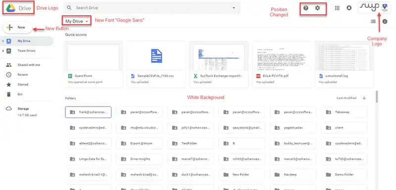
The top left spot of the interface will now be occupied with Google Drive logo.
- People who have included the customized company logo can see the logo at the top right corner now.
- The background color of G Drive is not gray anymore, it is white now.
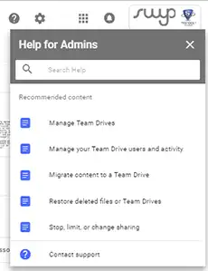
- “Settings” and “Help Center” icons are now positioned on the same line of search bar.

- “New” button also gets redesigned.

- A new font named “Google Sans” will be used for the Header.
- Team Drive icons and boxes also received changes.
When will the Users be Getting This Redesigned Google Drive?
The announcement of Google Drive redesign layout came from Google on the 9th of May, 2018. Though the announcement, Google said that this release will be available to all end users of G Suite. The complete rollout started around the second week of May 2018. Users who are on Scheduled Release track, will get the rollout between 23rd to 25th May. In case you have not been to G Drive for a while, visit today to see if it has been made available to you.
Conclusion
Google stated that the Google Drive Redesign has been done to create a sense of coherence among all Google products. This is the reason why the redesigned G Drive layout looks like the new Gmail interface. Google team believes that this new design will provide users with a responsive experience. According to the experts, the similar redesigning will be done to the other Google products and services too in the near future. For the time being, access your Google account and check out the similarity between Google Drive and Gmail.

